Web Components in Drayman
All Drayman components (usually defined at src/components/ folder) are rendered server-side.
They are built by combining HTML elements and other Drayman components, but sometimes it is difficult to build or reuse UI layout or interactivity which is usually done in the browser.
In this case Web Components can be used inside a Drayman components.
Web components can be built using vanilla JS or any other Web Component framework/library. For example, official collection of Web Components for Drayman called @drayman/elements was built using Angular Elements.
In theory, any existing JavaScript UI library can be used inside a Drayman component if it is wrapped inside a Web Component following some Drayman conventions described below.
Creating a Web Component#
Let's start with creating a file called amazing-button.js and putting it inside a public folder:
class AmazingButton extends HTMLElement {  constructor() {    super();  }
connectedCallback() { this.style.backgroundColor = "#daad86"; this.style.height = "50px"; this.style.cursor = "pointer"; this.style.padding = "5px 10px"; this.style.borderRadius = "5px"; this.innerHTML = "Button"; }}customElements.define("amazing-button", AmazingButton);info
A connectedCallback method used here makes sure that the element is added to the DOM and is ready to be used.
This is a regular Web Component which displays a static element with some styles.
To use this component, you'll need to tell Drayman where to find it. To do so, modify your package.json file by adding drayman section:
// ... "drayman": { "elements": { // Web Component name "amazing-button": { // Path to the script "script": "./public/amazing-button.js" } } }// ...Finally, use it inside a Drayman component:
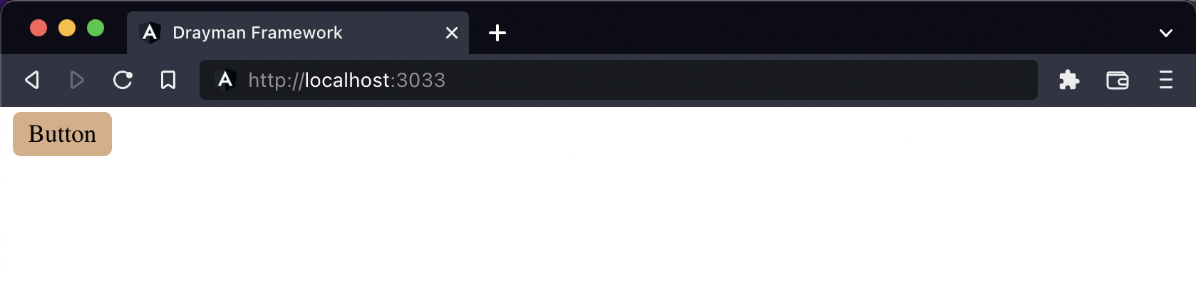
export const component: DraymanComponent = async ({ forceUpdate }) => { return () => { return <amazing-button />; };};In result, you will see something like this:
Passing options to Web Component#
Options can be passed to Web Components like any other options/attributes in Drayman Framework:
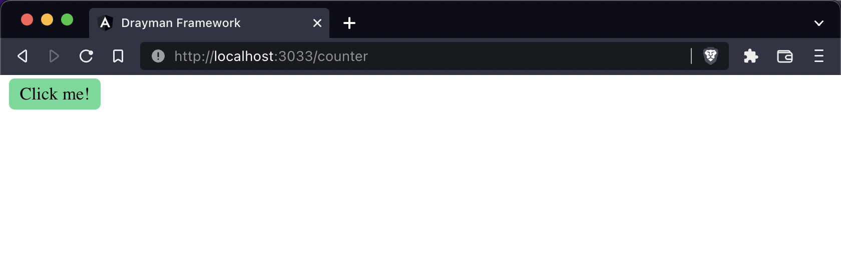
export const component: DraymanComponent = async ({ forceUpdate }) => { return () => { return <amazing-button label="Click me!" color="#5cdb95" />; };};To make it work inside a Web Component, reference this object with required option:
class AmazingButton extends HTMLElement {  constructor() {    super();  }
connectedCallback() { this.style.backgroundColor = this.color || "#daad86"; this.style.height = "50px"; this.style.cursor = "pointer"; this.style.padding = "5px 10px"; this.style.borderRadius = "5px"; this.innerHTML = this.label || "Button"; }}customElements.define("amazing-button", AmazingButton);In result, button now has a label and custom color:
Handling Web Component events#
Web Components events can be handled like any other events in Drayman.
class AmazingButton extends HTMLElement {  constructor() {    super();  }
connectedCallback() { this.style.backgroundColor = this.color || "#daad86"; this.style.height = "50px"; this.style.cursor = "pointer"; this.style.padding = "5px 10px"; this.style.borderRadius = "5px"; this.innerHTML = this.label || "Button"; this.onclick = this.onClick; }}customElements.define("amazing-button", AmazingButton);caution
Drayman requires special naming convention for events in Web Components. It must start with the on prefix and be in camel case.
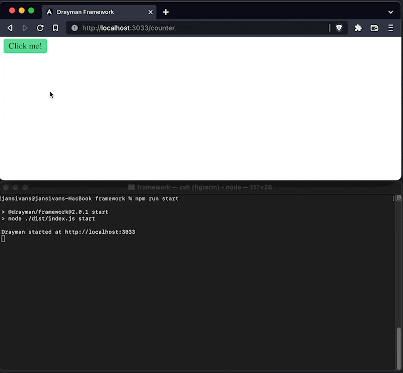
In the example above, we tell our button to handle Drayman onClick event when HTML element onclick event is triggered by overriding it.
Finally, we can handle this event inside a Drayman component:
export const component: DraymanComponent = async ({ forceUpdate }) => { return () => { return ( <amazing-button label="Click me!" color="#5cdb95" onClick={async () => { console.log("Button was clicked!"); }} /> ); };};In result, every time our button is clicked, we will see a message in the server-side console:
Publishing a Web Component#
Any Web Component can be published to NPM so it can be used in other projects or by other developers.
To do so, create a new folder with two files - amazing-button.js and packages.json:
class AmazingButton extends HTMLElement {  constructor() {    super();  }
connectedCallback() { this.style.backgroundColor = this.color || "#daad86"; this.style.height = "50px"; this.style.cursor = "pointer"; this.style.padding = "5px 10px"; this.style.borderRadius = "5px"; this.innerHTML = this.label || "Button"; this.onclick = this.onClick; }}customElements.define("amazing-button", AmazingButton);{ "name": "drayman-amazing-button", "version": "1.0.0", "description": "Demo Web Component for Drayman Framework", "license": "MIT", "keywords": ["drayman"], "drayman": { "elements": { // Web Component name "amazing-button": { // Path to the script "script": "./amazing-button.js" } } }}Pay attention on how element is defined inside a project.json file.
It is important to define drayman.elements object where all paths of Web Components are defined.
This way when a package is installed inside a Drayman project, you don't need to reference it in any way - Drayman will automatically do it for you.
Finally, publish your Web Component package to NPM:
npm publishInstalling third-party Web Component package#
If all requirements from previous steps are met, installing third-party Web Component package into your project is as simple as:
npm install drayman-amazing-buttonDrayman will automatically find installed Web Components and add them to your project.